How to Achieve Color Harmony in Home Decoration?
Create an aesthetic and functional environment in your living room, bedroom, and teenage room with color harmony in home decoration. Design modern, spacious, and cozy spaces with {xxx_cvt_txt} furniture recommendations.
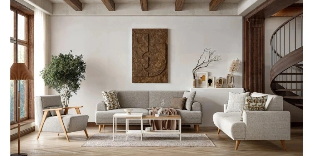
Color harmony in home decoration ensures that your living spaces look balanced both aesthetically and functionally. Proper use of colors affects your mood, makes the space appear larger or warmer, and helps your furniture stand out. So, which colors should be preferred in different areas like the living room, bedroom, and teenage room, and how should you choose your furniture accordingly? Here are energetic, up-to-date tips with {xxx_cvt_txt} furniture recommendations!Color Harmony and Furniture Selection in Living Rooms
The living room is one of the most used areas of the house and is where color harmony in decoration is most emphasized.A Spacious Area with Light Colors
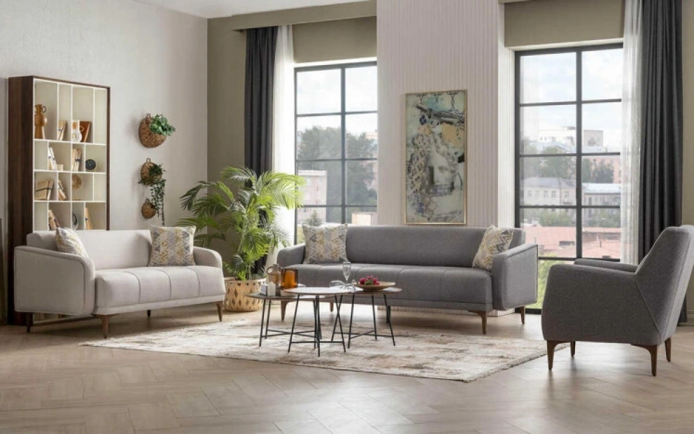
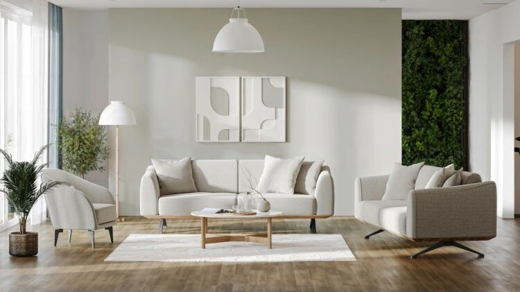
Light tones make the living room appear more spacious and airy. You can use neutral colors like beige, cream, and light gray on the walls. These colors are especially perfect for small living rooms and make furniture selection easier. For a light-colored living room, pastel-toned sofas and wooden details create a harmonious combination. For example, {xxx_cvt_txt}'s Astrid Sofa Set is an ideal choice for this style with its minimalist design and light-toned preferences. Astrid, with its expansive and simple lines, creates both a spacious atmosphere in your living room with its cream-beige tones and adheres to modern decor trends.

Add Energy with Vibrant Colors
If you don't want to use only neutral colors in your living room, you can add energy with colorful accessories and cushions. For example, an orange or olive green sofa combined with cream walls creates a modern yet warm environment. To support this dynamic style, choosing eye-catching yet harmonious furniture is crucial.
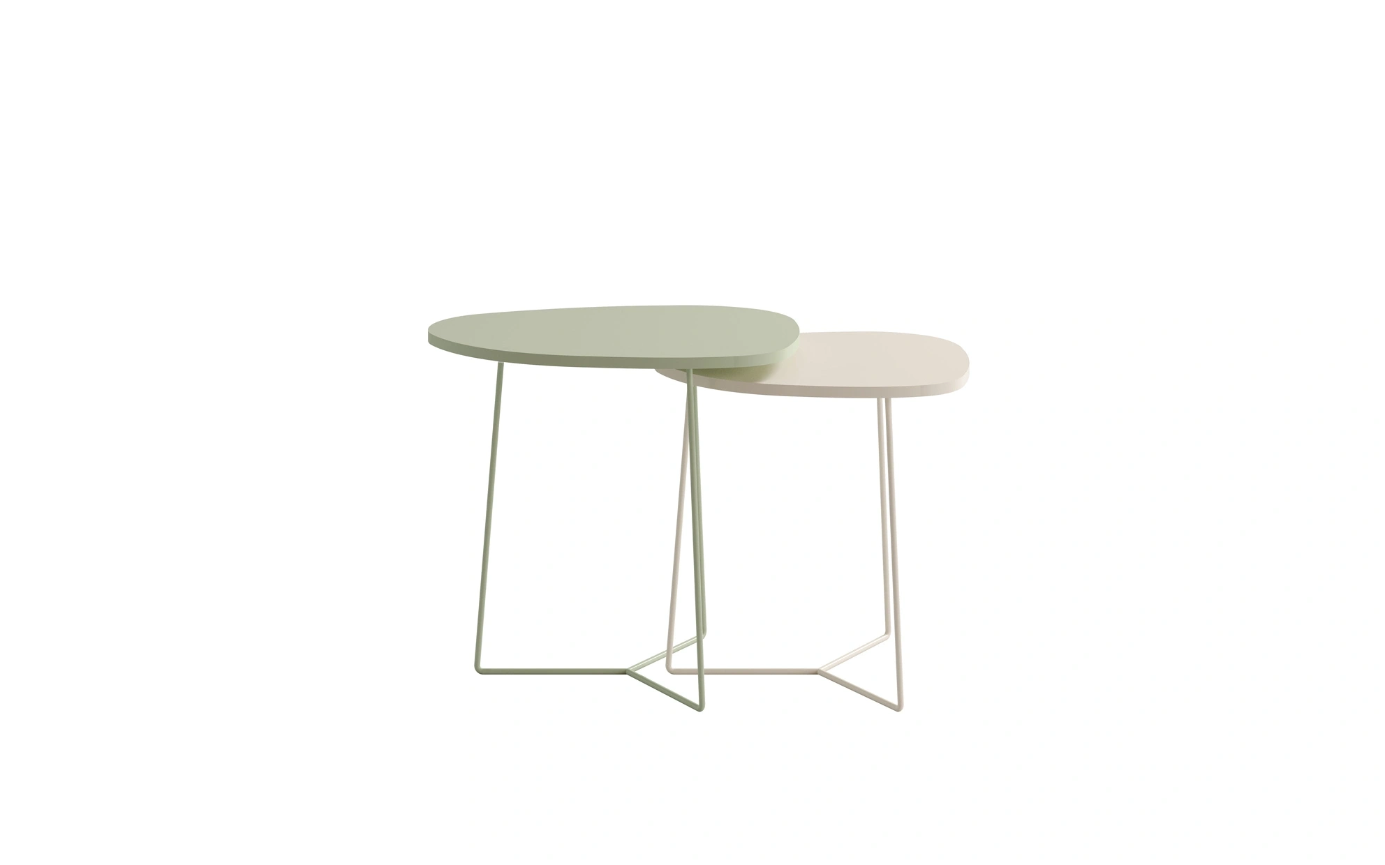
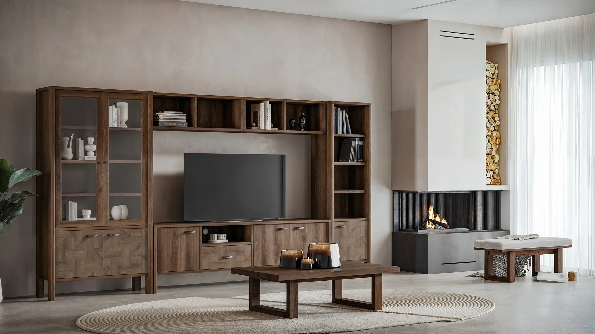
{xxx_cvt_txt}'s Nuba Nesting Table model steps in here with its design and warm wood-metal details. Its elegant lines and natural color tone create a contrast with colorful sofas in your living room, while its practical use enhances functionality. The Nuba Nesting Table is a great complement for living rooms seeking both a modern and warm atmosphere.Elegance with Contrasting Colors
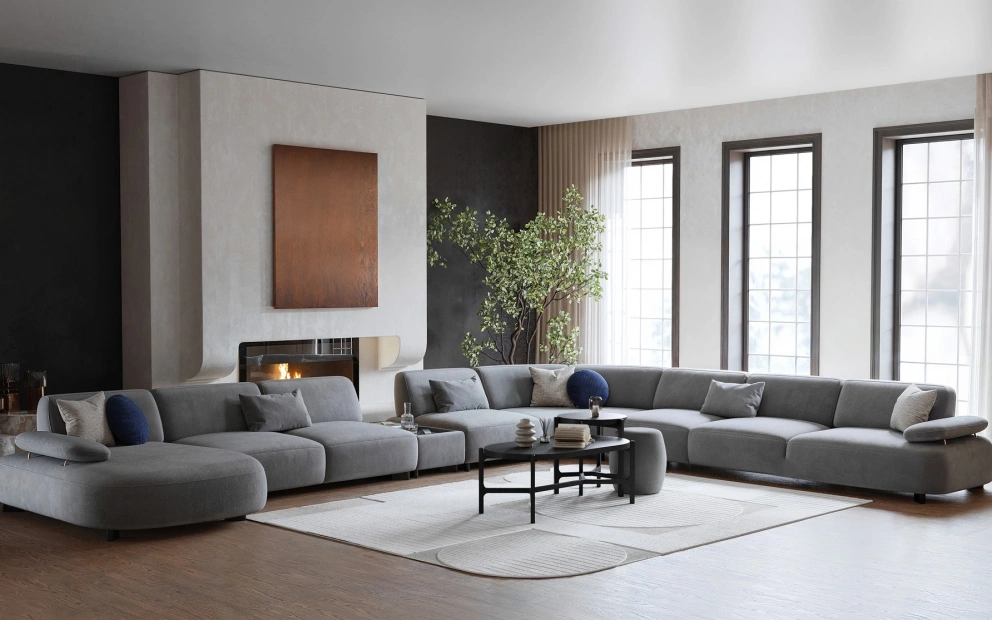
Contrasting colors add a dynamic vibe to your living room. For example, a dark blue wall and white sofas create a modern and sophisticated effect. Choosing furniture with metallic or black details supporting this contrast ensures the integrity of the decoration.Peaceful Colors in the Bedroom
The bedroom is the most private and restful area of the house. Therefore, peace and comfort should be prioritized in color selection.Neutral and Pastel Tones
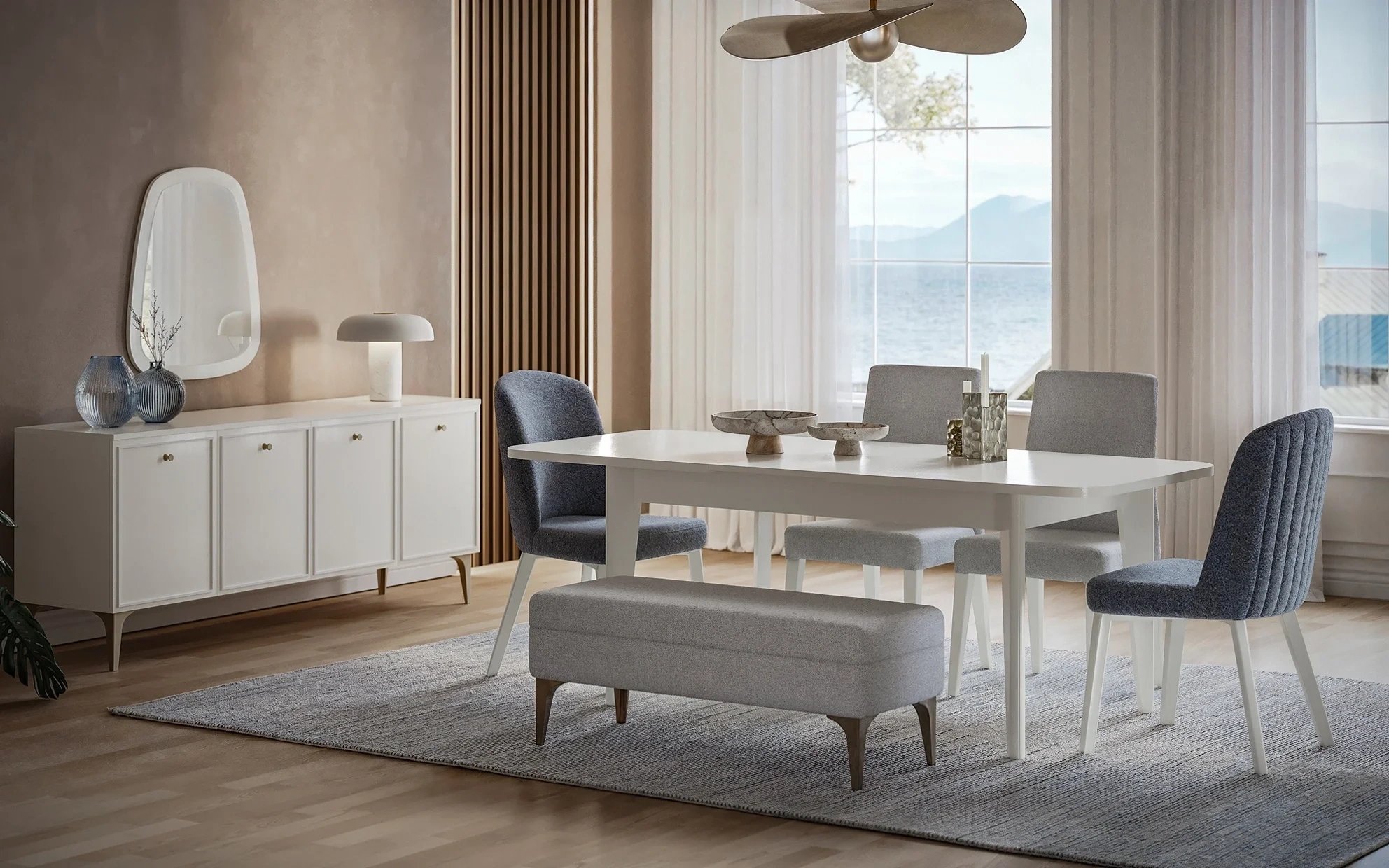
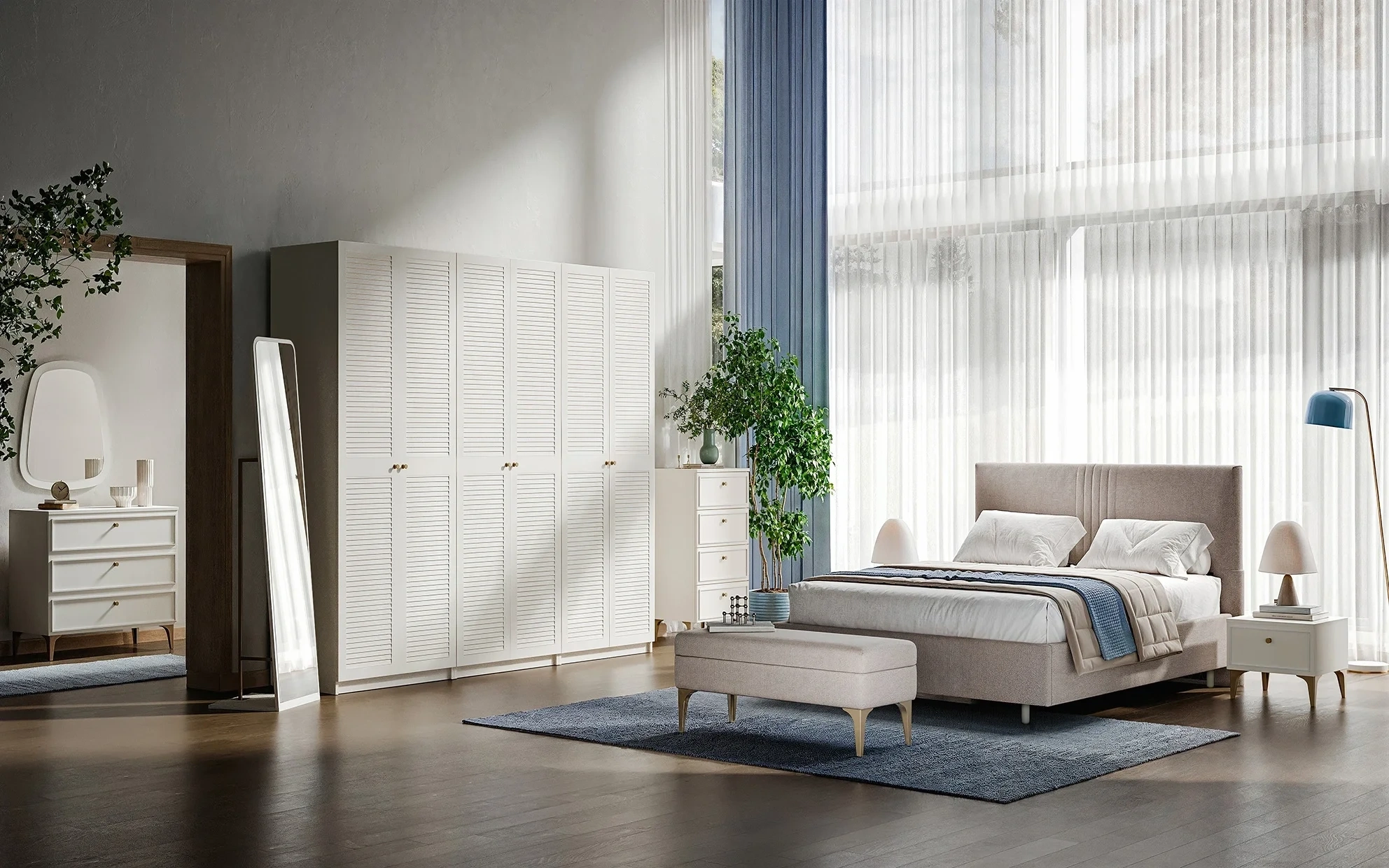
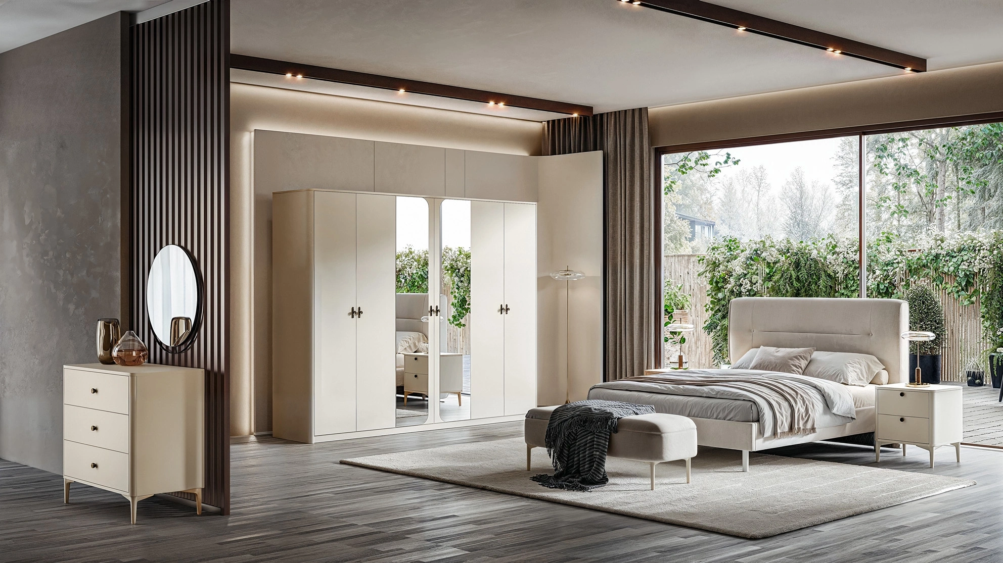
In the bedroom, you can prefer calming tones like cream, light gray, pastel blue, or lavender. These colors reduce eye strain and improve sleep quality. Furniture like white or light wood beds and wardrobes provide a harmonious look with pastel tones. {xxx_cvt_txt}'s Lily Bedroom set beautifully aligns with this soothing color palette. The light-colored design and elegant details of Lily create a fresh and tranquil atmosphere in your bedroom when combined with pastel-toned walls. This set, prepared with minimalist lines and quality materials, is perfect for creating both a modern and relaxing sleeping area.
Minimal and Modern Touches
For those who love minimal design, sticking to a few colors in the bedroom is ideal. For instance, light gray tones on the walls and white bed linens create a modern atmosphere. Using natural wood in bedside tables and nightstands adds warmth to the room.Relaxing Atmosphere with Natural Details
Adding natural textures to the bedroom creates a peaceful environment. Wicker baskets, cotton curtains, and linen bed covers, combined with pastel tones, provide a modern decoration.Dynamic and Fun Colors in the Teen Room
The teen room should be both a reflection of personal taste and an energetic space. Therefore, making bold and colorful choices are important for color harmony.Vibrant and Bold Colors
In the teen room, you can use vibrant colors like blue, orange, green, or purple. You can prefer these colors on a portion of the wall or in furniture to enhance the room's energy. For example, painting one wall dark blue and keeping the other walls light gray provides a balanced yet modern look.Functional Furniture Selection
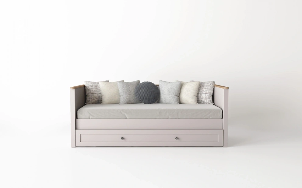
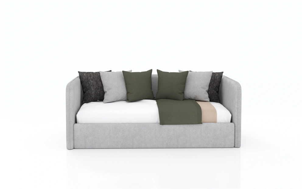
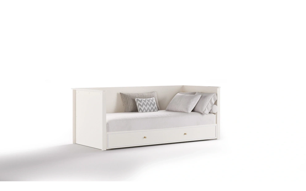
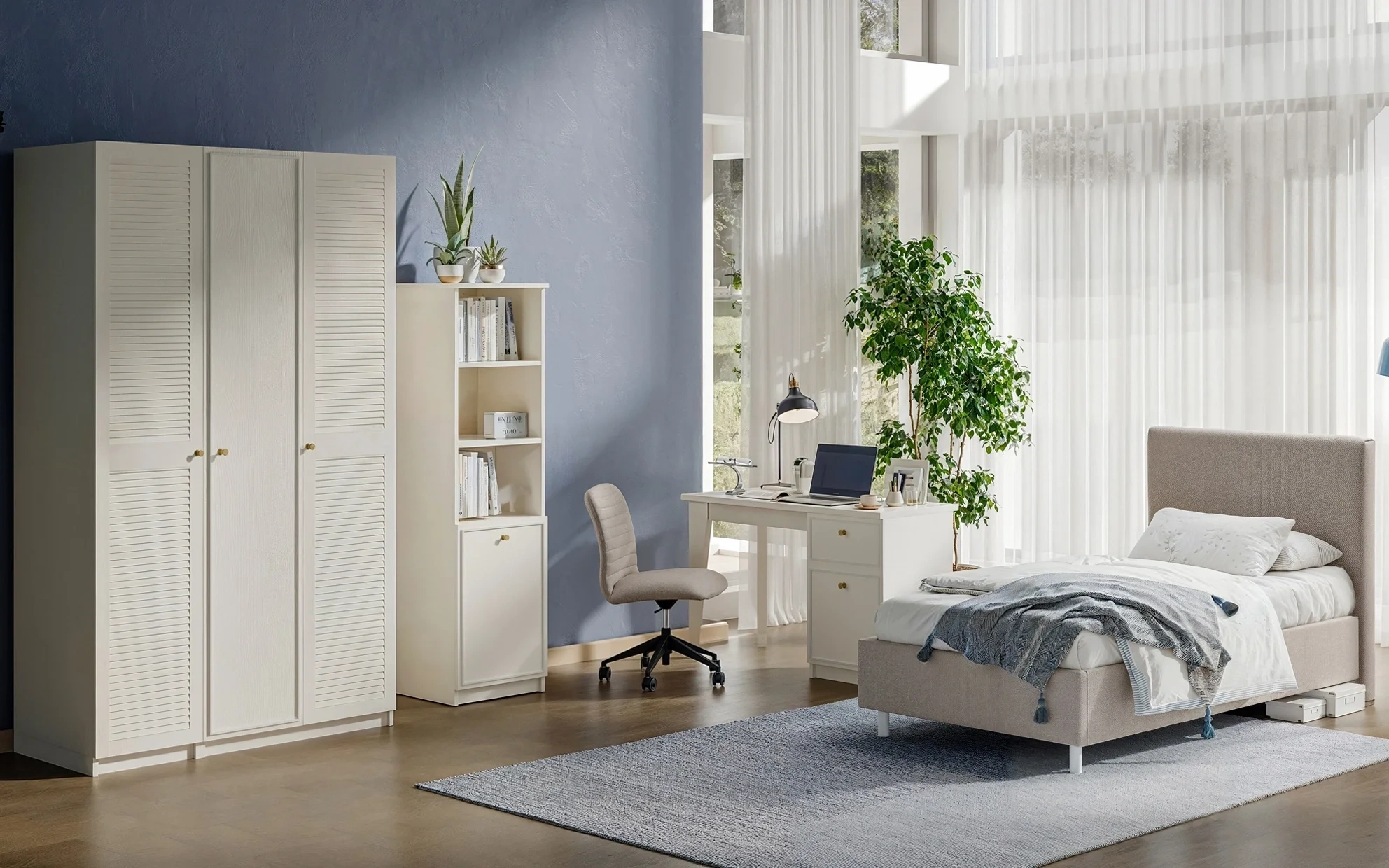
In the teen room, both color and function are important. Colorful headboards, modular wardrobes, and desks are both decorative and practical. Light-toned furniture makes the room appear more spacious and creates a contrast with vibrant colors. At this point, {xxx_cvt_txt}'s Narva Teen Room set is an ideal choice.
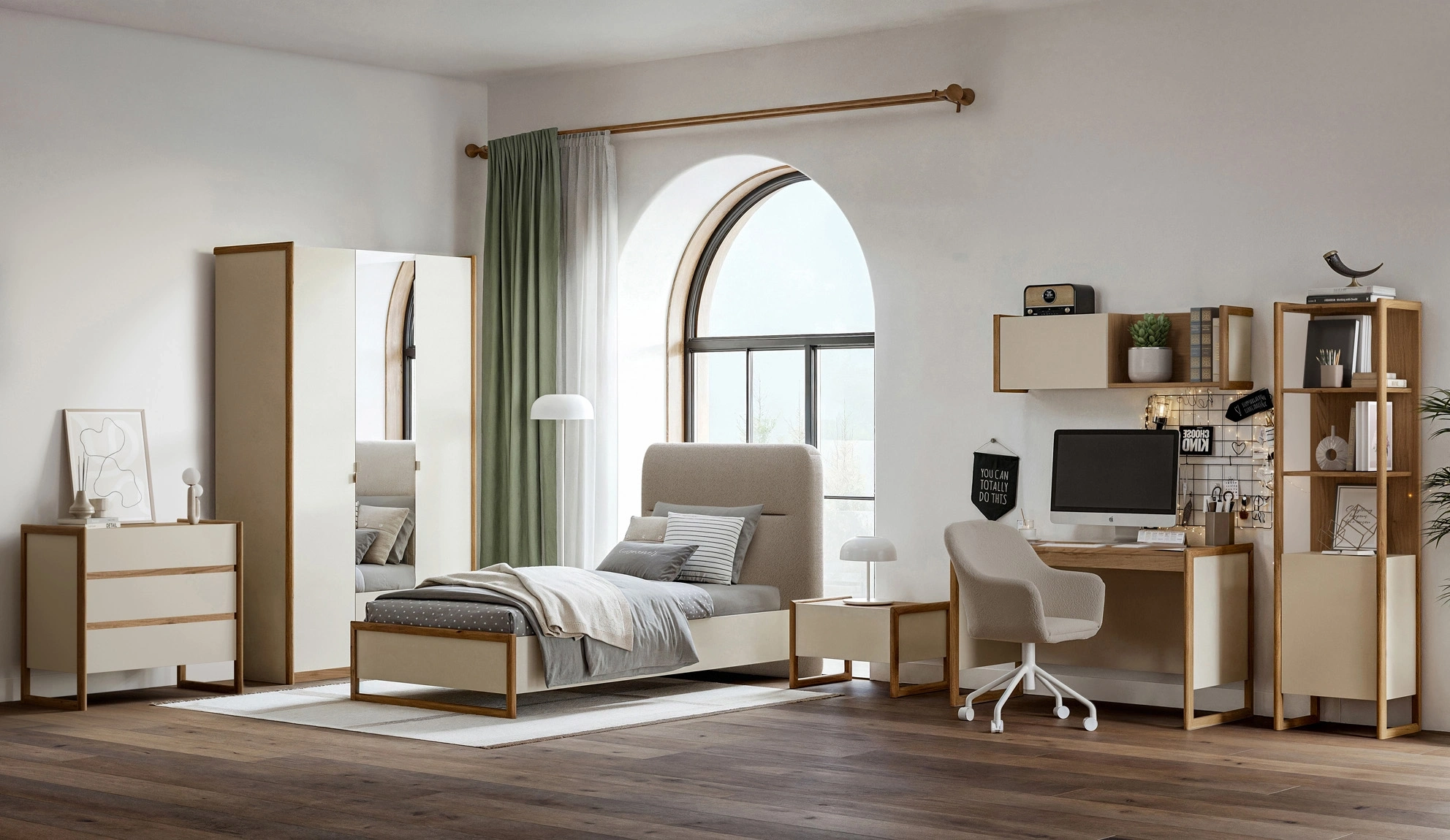
The light-colored furniture surfaces ensure the room is perceived as wide and airy, while its modular structure easily adapts to different usage needs. With its vibrant color details and modern lines, Narva adds energy and dynamism to teen rooms while creating a spacious atmosphere.Personal Touches
Adding personal touches to the room allows teens to express themselves. Posters, colorful shelves, cushions, and rugs increase the room's energy and complete the color harmony.General Tips for Color Harmony- Three Color Rule: Using typically three main colors in decoration ensures harmony. Choose a primary color, complementary color, and accent color.
- Natural Light and Color Balance: The light intake of the space plays a crucial role in color selection. Rooms with ample sunlight can comfortably use darker colors.
- Furniture and Accessory Harmony: The colors of furniture and walls should complement each other. For instance, a light-toned wall can be balanced with dark-colored furniture.
- Texture and Material Combination: Color harmony is achieved not only through tones but also textures. Wood, metal, glass, and textile textures add depth to the decor.
Create Modern and Cozy Spaces with Color Harmony in Decoration
Color harmony in home decoration makes living spaces more enjoyable, aesthetic, and functional. Whether it's the living room, bedroom, or teenage room, with the right color selection and furniture combination, your home achieves both a modern and friendly atmosphere. Use colors boldly, but always keep harmony at the forefront! For more inspiration and stylish furniture options, visit {xxx_cvt_txt}.Frequently Asked Questions
1. How exactly is the "Three Color Rule" applied?
One of the most popular methods to ensure balance in decoration is the 60-30-10 rule. 60% of the space should be a dominant primary color (typically walls and large furniture), 30% a secondary color (such as curtains or a rug), and the remaining 10% a vibrant "accent" color (such as cushions, accessories, or artwork) that adds character to the room.
2. Can dark-colored furniture be used in small rooms?
Yes, but it's essential to establish the right balance! By combining a dark-colored piece of furniture (such as a navy or charcoal sofa) with light-colored walls and a light-toned rug on the floor, you can prevent the room from looking stifling. You can also use mirrors and proper lighting to counteract the narrowing effect of dark pieces on the space.
3. Do all rooms in the house need to have the same color palette?
There is no such obligation, but having an overall "style coherence" across the house offers a more professional look. Even if the colors differ entirely between rooms, the tone of wood used, metal details, or similar textures (such as the use of linen fabric) help maintain visual continuity throughout the house.
4. Does color selection really affect our psychology?
Absolutely! For example, blue and green tones are ideal for bedrooms as they lower blood pressure and evoke a sense of calm. Warm colors like orange and yellow increase energy and appetite, making them preferable in social spaces like the kitchen or living room. The color you choose directly impacts the quality of the time you spend in that room.